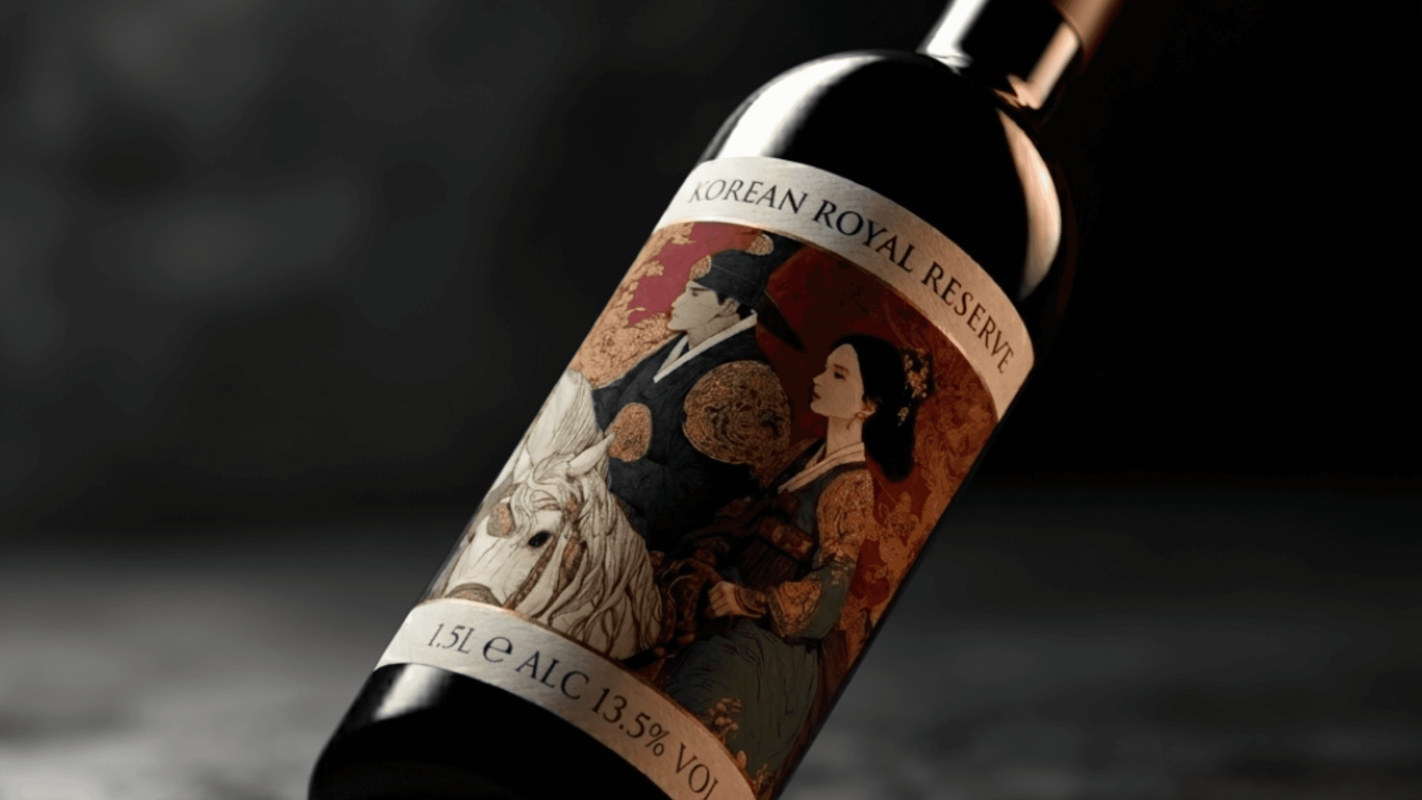
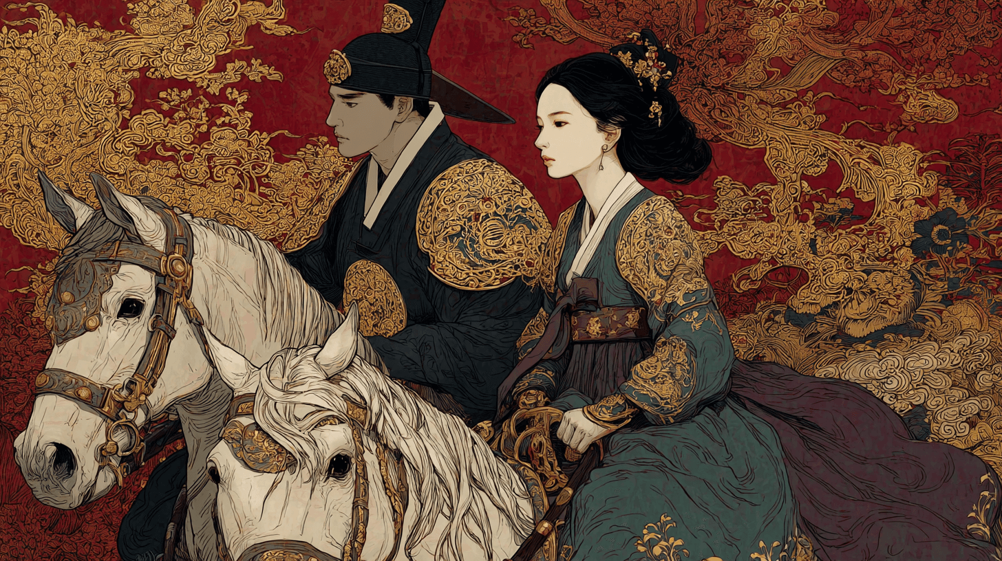
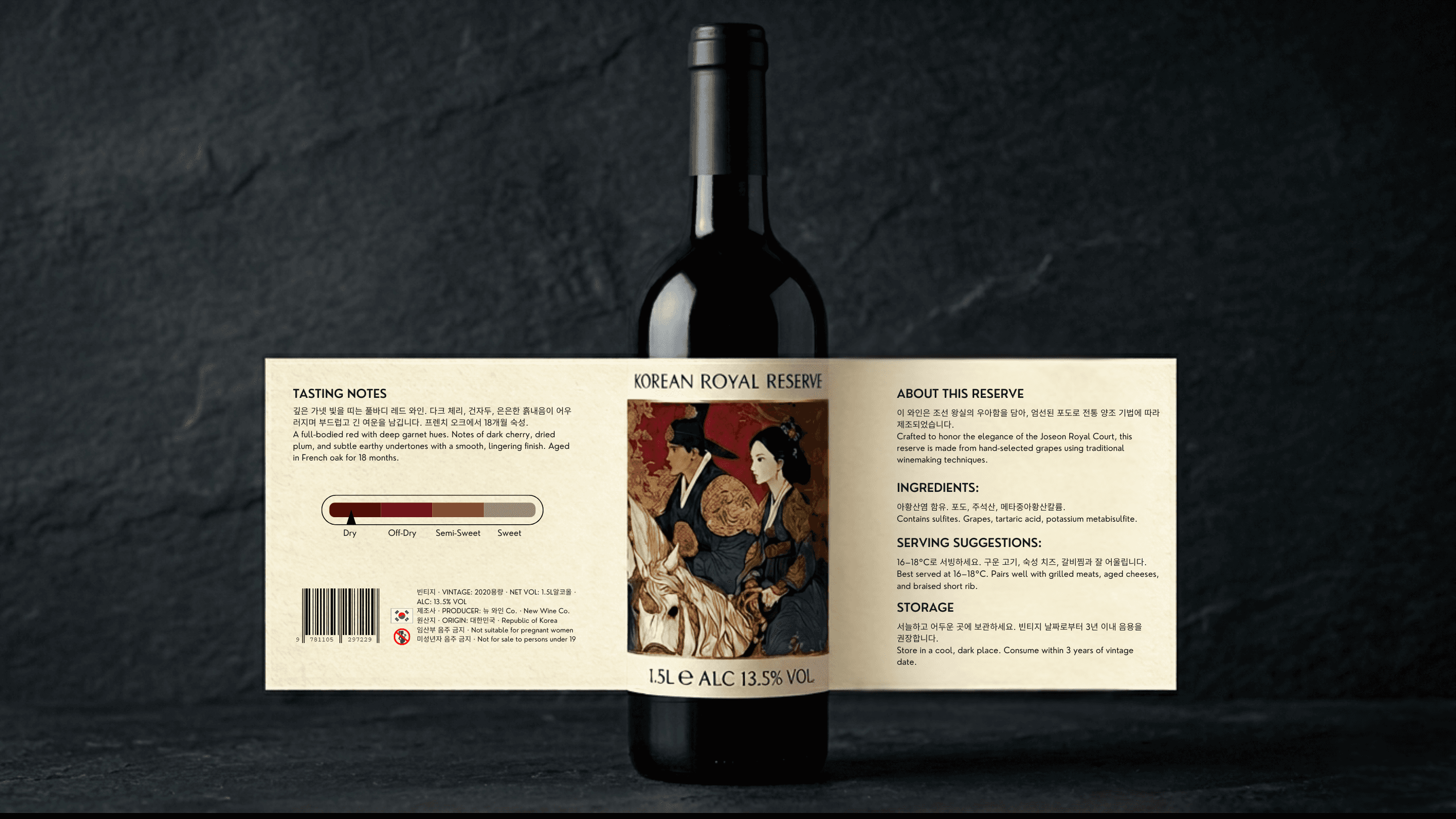
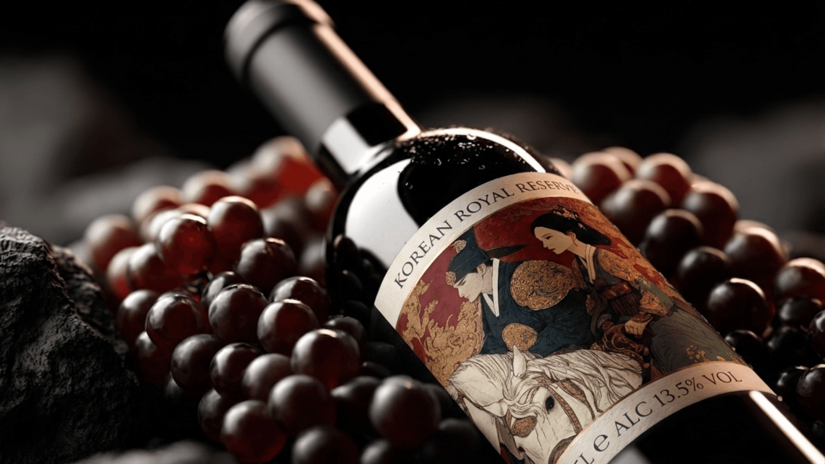
Korean Royal Reserve needed a label system that could position a premium red wine in a market where cultural identity and F&B compliance both have to live on the same 1.5L bottle. I developed the full label design built around original Joseon court illustration art, Minhwa style artwork depicting a Korean nobleman and noblewoman on horseback in gongbi fine-line technique. From there I structured both the front and back label for real retail standards, writing bilingual Korean and English copy from scratch covering tasting notes, sulfite-compliant ingredients, serving temperature, storage instructions, and all required legal copy. The product shot direction followed the same intentionality — a cinematic overhead. The final mockup placed the finished label onto a dramatically lit bottle against dark slate, showing exactly how the design performs. The result is a label that reads as culturally specific and shelf-ready.
Category:
F&B Label Design & Product Visual Direction
Client:
Korean Royal Reserve
Duration:
3-5 Weeks
Location:
Jeju, Republic of Korea